Problem
Around 2016 I joined a company and for a few weeks I was honing what the team had already done before me. While checking all the different designs, flows and assets, I also started doing an inventory. My hypothesis was that if we relied on previous designs to build the next ones, soon we would create inconsistencies that would grow our design debt exponentially as the product grew. Soon after, we started building our first design system. Since then I have taken design systems as the de-facto way of building modern products and services.
Design systems aim to bring a unified way of building a product, but they also aim to free designers’ and developers’ time from repetitiveness, ultimately saving a lot of money for the company as well. When I joined Posti in 2020, the goal was to create a single source of truth when it comes to how our products look and feel towards our customers, and fix all the different products and services that looked like they were all different from each other.
Audience
A design system is a product that serves different teams with different needs. The customers of a design system are internal stakeholders: primarily designers and developers. They want to build fast but without sacrificing quality. They want their work to be effective, to minimize risk, and eradicate unknowns.
Indirectly the results of a good design system are seen in the end product and the ultimate customer is the end-user. The components of a design system are tested through flows and screens with the end-user when designers do user testing. And that’s where we learn whether or not they are helping our products become successful.
Process
Research
I have started my work at Posti by interviewing all the related stakeholders at Posti. I have written a lengthy article on the importance of research when creating a design system (but also along the way of developing it). So it was important for me to understand:
- What are the current pain points of our (internal) customers?
- How are they currently doing their job?
- What are the opportunities that we can solve first as low-hanging fruits in order to create progress?
Additionally, It was important to understand subjects like current technologies used, challenges, legacy systems, but also opportunities to either refactor or kill old inefficient tooling.
Inventory
The next part of the process was to start with an inventory/audit of the current states of our products and services. There were 2 different instances that needed attention. What was live already and what was in the works. Cataloguing a list of all the different components used by different teams is a painstaking process, but it is a journey that helps create a good basis for long-lasting design systems.
Finding the right taxonomy & hierarchy
Once having a basis for any component available but also components to be needed in the future, it was important to create a taxonomy and hierarchy that works. At Posti I chose to use the system mentioned in the book Expressive Design Systems by Yesenia Perez-Cruz. This helped us to a great start, and since then it has become also a standard.
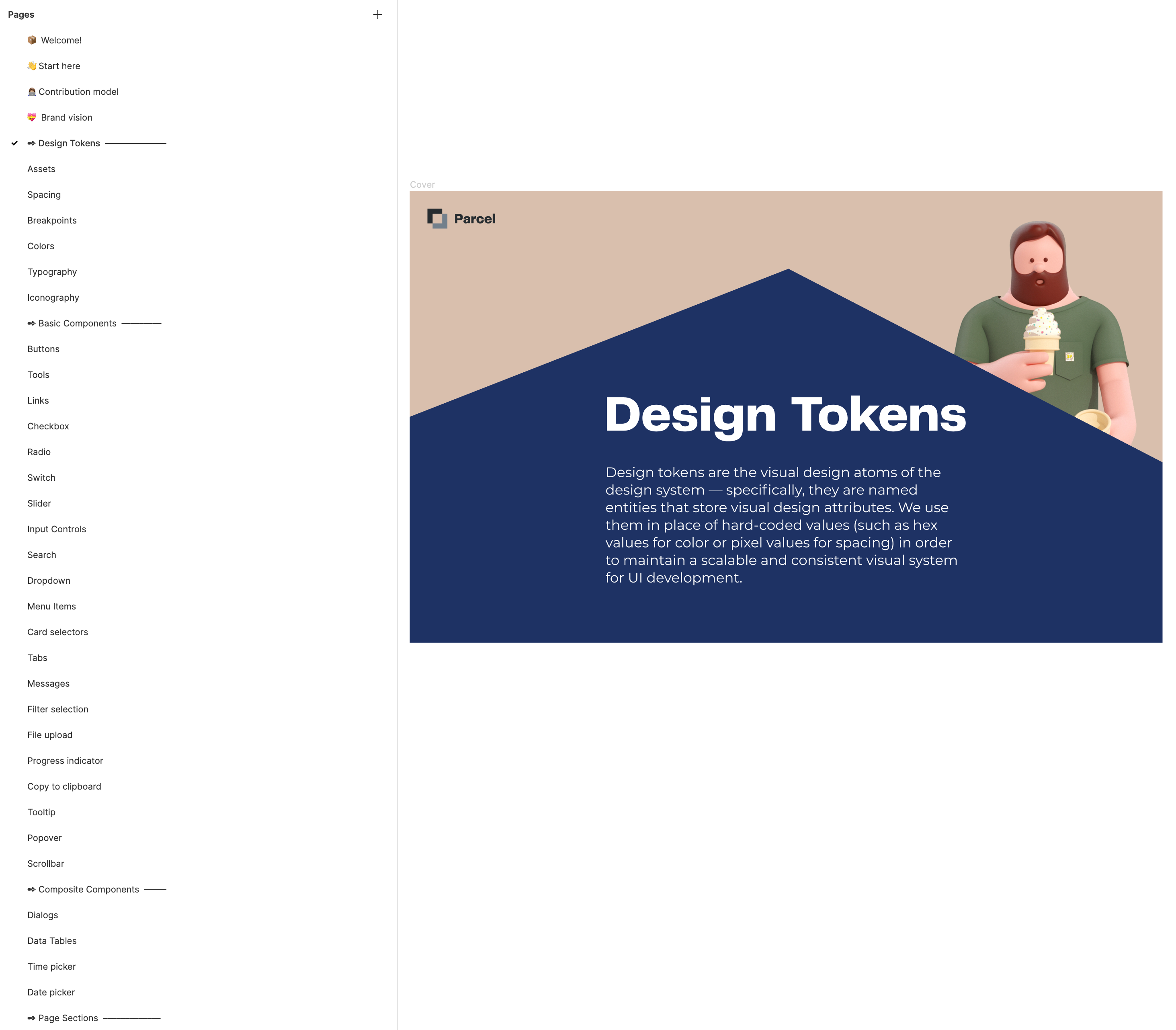
Design tokens are the smallest decisions that designers need to make when creating components (colors, typography, iconography etc). Basic components are the smallest components that you could have (buttons, controls, inputs etc). Composite components are the ones that can have basic components inside them (modals, tables, time, and date pickers). Page sections and page templates are complex structures that standardize patterns around Posti products.
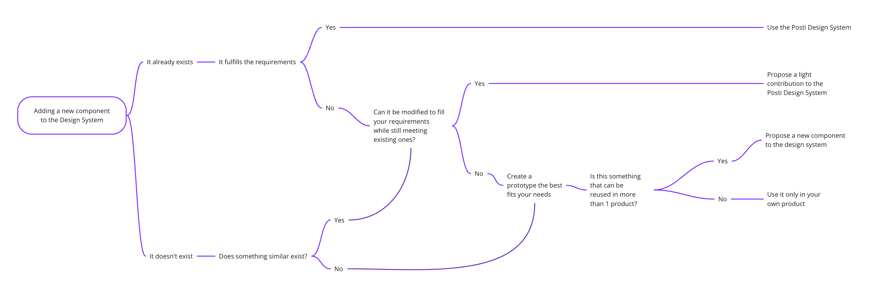
Managing Contributions
Contributions take many forms and can come literally from anyone. Developers can fix bugs, or build components (existing and new). Designers can design components, test with users and design cohesive experiences. Product owners and business stakeholders can give feedback and test. And all of these groups can improve components and documentation, through open dialog, and the channels we have for support (Slack, Teams, and meeting rituals).
The process of the contribution model follows a logical approach from proposal to design, to code, to documentation, to release. Under the hood, those steps have their own decision trees that help people at Posti have a consistent and effective way of working together.
Building and scaling components
Scaling the components is a natural part of the process that aims on covering all the use cases that are shared across teams. At Posti when we built most of the default use cases for components we started building the states that included on-hover, on-press, focused, active, and inactive states. On top of that, it was important for us to make sure that all the components were accessible on the AA standard by WCAG, and we even ran audits with 2 different agencies.
The stack
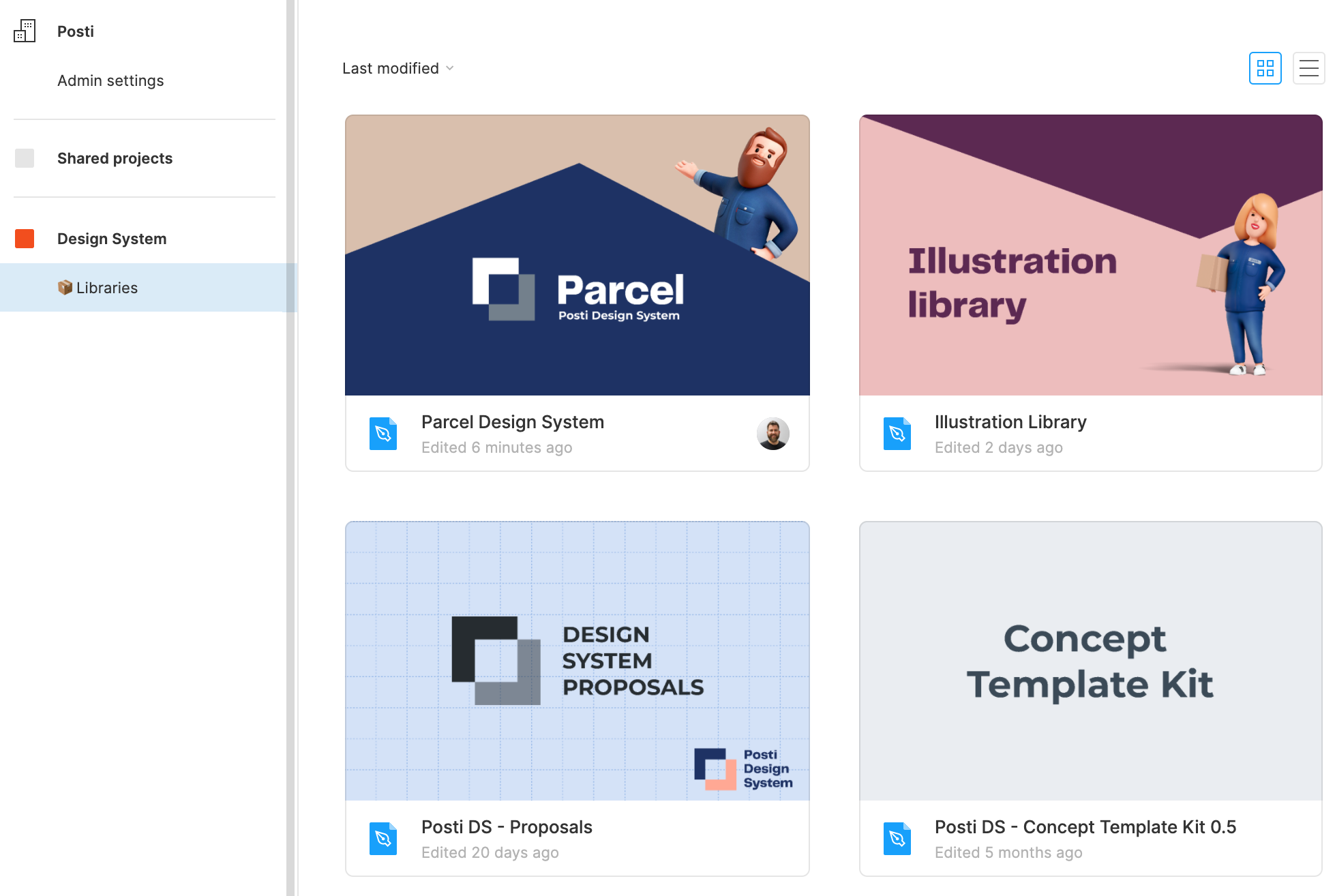
A design system is not just a library in Figma. The actual development of the components started on React and Storybook where Posti houses all the technical components and documentation. Overall teams need a lot of different tools to establish a working design system and choosing the right stack will help them with their work.
For our team we chose:
- Figma (design side of components)
- Storybook (React components)
- Github (the environment)
- Slack (async communication & updates)
- Teams (meetings)
Establishing rituals
We had to establish rituals that would help us work on the design system like a product. The design system team meets up every day to discuss what has happened so far and will happen on that day. There are also regular weekly meetings for planning the work ahead in the coming weeks. Doing inventories with designers on certain components and aligning on how we use them across teams helped to visualize variations and fix inconsistencies.
On top of that sharing biweekly clinics proved to be critical for a long time especially when we were doing the bulk of the work. Our goal was to be reachable and help whoever we can whether they want to start a new project or whether they would like to create some components.
More than a design system
We did not stop with UI components when it came to our own design system. We are also offering an illustration library that has custom illustrations that can be used by all our products. We also have a set of canvases that help teams to collaborate better. This set includes things like service blueprint templates, customer journey templates, goal setting and OKR templates, etc. We wanted to make collaboration beyond design and development as easy.
Result
We are currently serving 17 teams across many value streams and channels. Our governance model is having a centralized design system team that is there to support maintain and scale the design system while everyone else is able to contribute and be part of it. Our team consists of a product owner, two developers, and a QA specialist. In 2 years the design system expanded from 150 components to 800 including variations, states, and all the different tokens and illustrations. In 2022 we are planning on launching our public reference website that will also be our documentation site and the one-stop to know everything about the design system.
Key findings
- Starting is slow but pays off in the long run
- Research is key not only to begin with but also along the way
- Accessibility should be embedded, not a layer
- Rituals are important and making sure you align with designers is key
- Design Systems are complex systems so take your time to document properly each component from the very beginning
- A good structure of the team, process, and collaboration move things forward
- Share the work and share it often. Always ask feedback
- Design systems do not solve deep organizational problems. You still have to do all the fuzzy work with your coworkers