Lean design methods for a startup

Problem
The information about music is scattered all around the web. Often, when users want to search about an artist, they will google their name, go to Wikipedia to read the biography and background info, then go to Youtube and listen to a few songs with video clips, or streaming services like Spotify. If they want images of the artists, they will most likely go to google again, or Last.FM and circle back and forth to those and other different services.
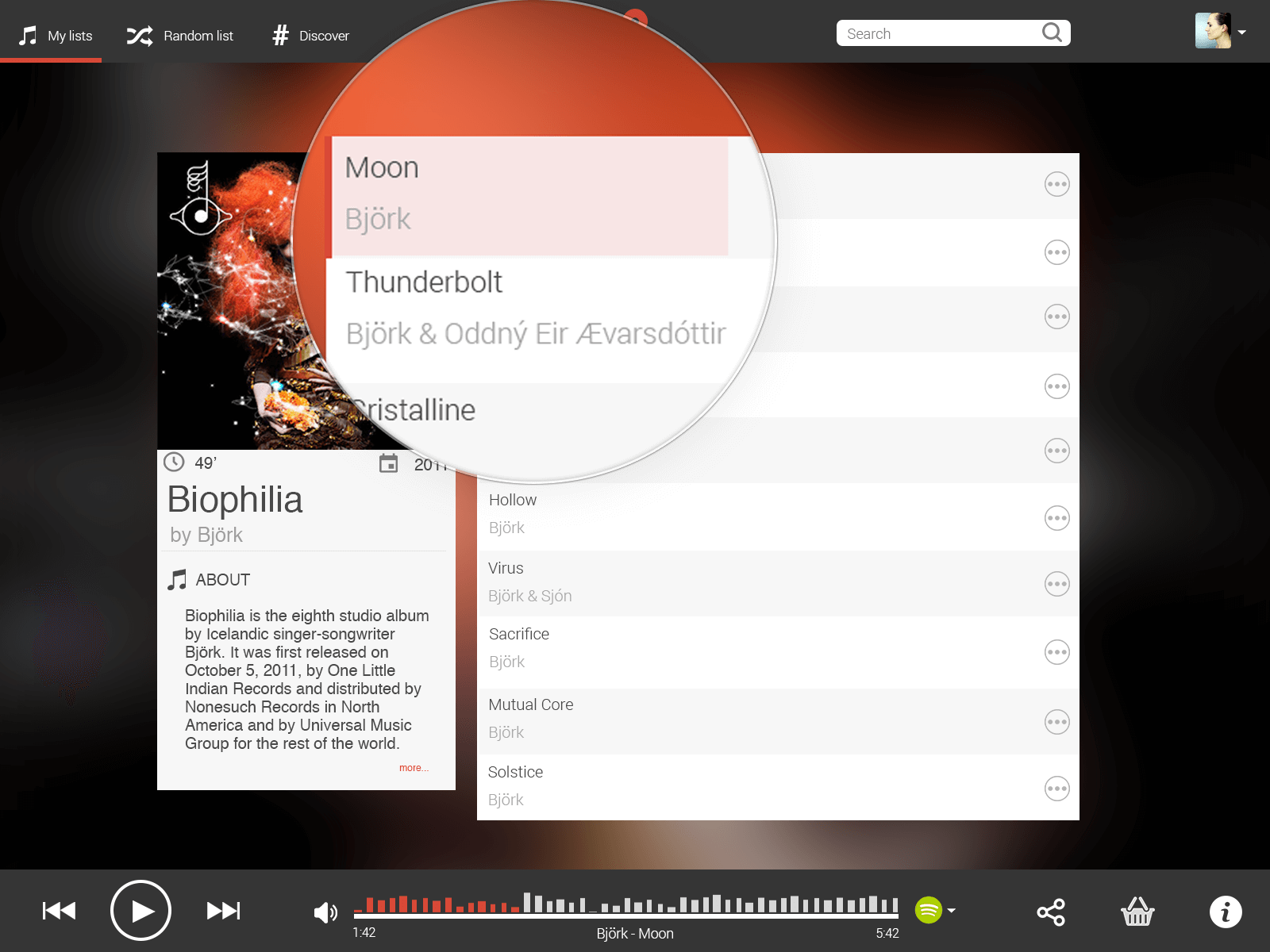
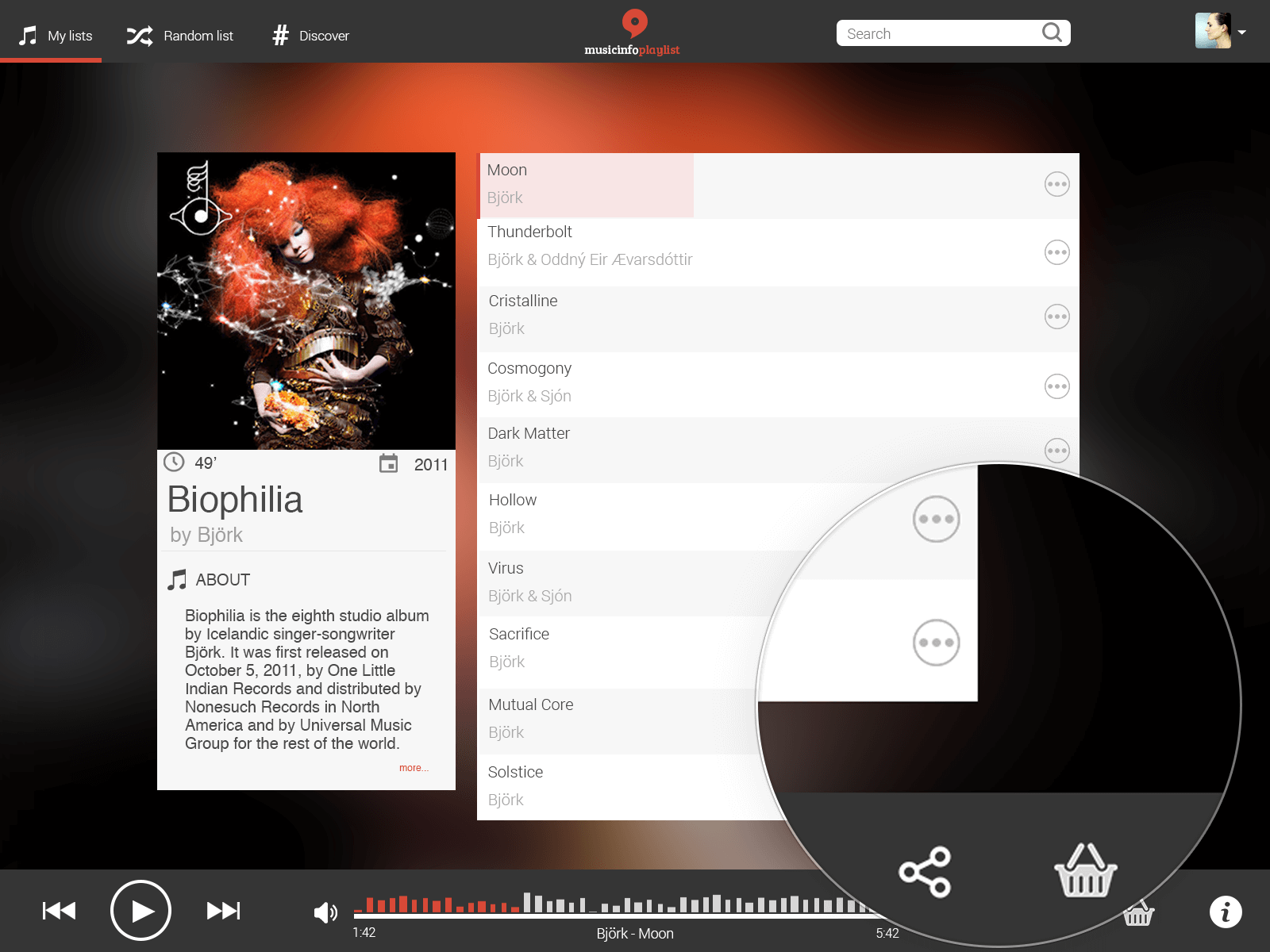
Musicinfo aimed to bridge this effort for the users by combining all that data from those services into one profile. The service was based on an intelligent algorythm that would pull all the information in a database and use APIs from those services to keep up-to-date information in real time. TL;DR: Think of it as the IMDB for music.
I joined Musicinfo as the first team member after the founders and started by developing the company identity (Logotype, fonts & colors). Right after that I started digging into the first wireframes and mockups for parts of the service as well as the artist profiles.

Audience
Musicinfo's main target group is music-philes, people who enjoy and is heavily invested in music. Collectors, and basically heavy listeners who have a connection with music and of course are willing to buy music, get merchandise, subscribe to streaming services and thus, be in need for a service like Musicinfo. A one stop go-to place for everything music.
The service (mainly web service) had to host the needs of those people who would want to access easily the information of each artist they like, explore new ones and interact with the various content. At the same time the service must reflect accessibility and an easy interface for every user that does not rely so heavily on such service anyway.
Process
Note: The branding is obviously excluded as the process is referring to an UX-related case study.
Over the course of 2 years I have developed various mockups and prototypes for the main service and other concepts. It was a rather steep process because back in 2012, User Experience was in the very early stages of becoming essential to companies (at least in Europe), but the lessons learned trying to implement UX processes in a service when you start from scratch in the subject, are invaluable and priceless. That, coupled with no resources for anything extra (front-end development, user testing groups etc).
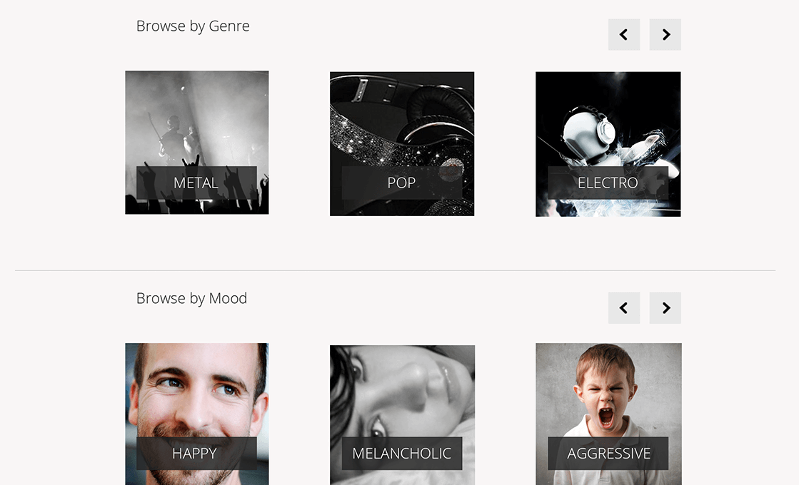
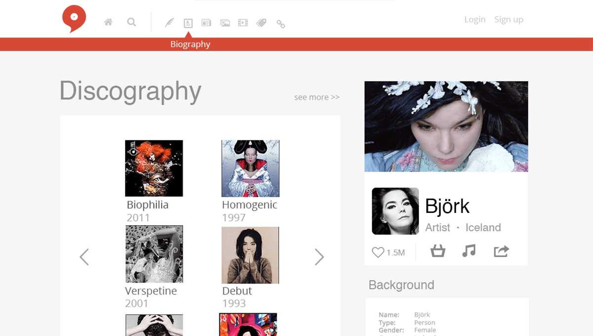
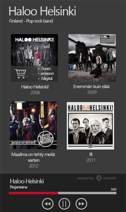
Initially we started by understanding what the service had and should offer. That was the necessary information infrastructure so that we could start comprehending what we wanted to build and sketch the first ideas. I started creating mockups after classifying and recognizing the levels of information on the database. For example there were 10 billion data points and all of them relevant to artists.
Information like that included:
- Discography (from 2 different services)
- Biography (at least from 3 different services)
- Photos (mainly from Last.FM)
- Background (Wikipedia & Discogs)
- Videos (Mainly Youtube official artist channels, & VEVO)
- Related Artists (3 different services like MusicBrainz)
- Streaming services available for each artist (Spotify, Deezer & Rdio)
- Social Media of artists
- other secondary level information like instruments, BPM, Tempo etc
After mockups were ready close to a pixel perfect result that we would want to have as a prototype, we used students to A/B test a few designs (due to our close cooperation with the Jyväskylä University of Applied Sciences). Iterations followed after observing the students and gathering the feedback and some designs came to be the final mockups for the service to be developed. In Finland the students as a focus group were a good match because of their age, involvement with Internet and Social Media and music services. They were a sub-part of the heavy music listeners.
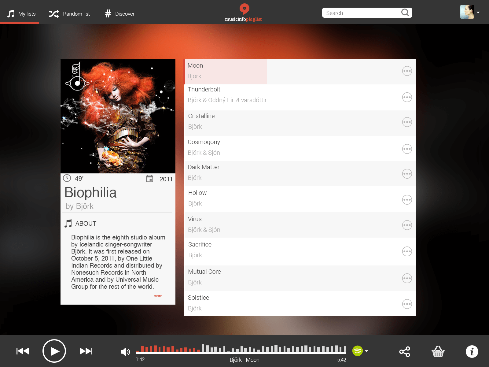
During those 2 years we explored many ideas for development, such as playlists, or online radio player with real time information about artists, as well as concepts for native mobile applications (Android).
Result
In the end we were able to create a holistic service for music, while keeping in mind the needs of the users. Involving students in the user testing even in the really early stages, helped us solidify the experience we could give them. With a really small investment in Google Adwords we saw that a service like that is something that people are searching for, however the music market is dominated by huge players. At the same time, traditional radio services are looking ways of diversifying their products and a service like that is some great addition to them.
Key findings
Startups fail all the time. The lessons you learn in the process are one of the most rewarding experiences in the worldKeeping UX as part of your business model as early as in team formation is a short investment in your companyThe music discovery is yet to be really discovered and that is where, even big services struggle a lot.