Problem
At Hubchat we were creating a tool for communities. Our first trial in the waters of communities was to try and identify segments of communities who could be part of this tool. Examples of those were; Learning Night Photography, Python Learning Club, Welcome to Helsinki (a community for expats in Helsinki, Finland), and many others. We managed to identify people who we could funnel into those communities and that worked great.
We had the chance to test the tool and gather meaningful feedback. It became evident that while this could work, it would not be viable perhaps as a business that can generate profit. Therefore we needed to sharpen the focus into more detailed path. That was done by going once again back in communities and discussing with people, their needs, their pain points etc.
The communities that we wanted to sharpen for were volunteer communities, that involve around learning, doing some public service, doing events, promoting tech, human rights and so on.
The feedback we got was what we expected. Those communities use a variety of tools to communicate across different types of members. Facebook groups to keep a large amount of members informed. Slack for organising and sometimes a second slack for a larger amount of other members and volunteers. Whatsapp or Telegram for more private. This creates a huge clutter for them, and frustrations because it hard to keep track who is where and if the right information gets to the right people.
Audience
As mentioned the focus was on active volunteer communities. As an example case study, I will talk about Junction Hackathon. Junction is organised every year by a volunteer community; Aaltoes. Junction gathers more than 1000 hackers from around the world for a weekend hackathon in Helsinki. The core organising team consists of 50-60 volunteers, and 250 more volunteers for the event recruited from schools and universities.
There’s a lot of communication that has to happen face-to-face. A lot of recruiting before the event. Involvement of members. Building the culture around Junction, keeping people organised and having them learn the tools and resources they can use. A lot of logistics, interactions, information exchange and all that while making sure that the right info goes to the right people.
Process
Prototyping
The process started with ideating on solutions. The thesis was to remove the clutter of communities using different apps for the same purpose while keeping their members in easy reach. We explored many options, like for example creating different feeds for the communities based on tags and filtering.
While talking and researching about these though it became evident that people need more real-time over anything else (chat like features over posts). And so we started thinking outside of the box, with what we have designed for Hubchat thus far. We would have different channels for the users, while keeping a feed for their most important posts in a feed.
We started designing with the idea of real-time features over Facebook-like group posts. Users could have dedicated channels (or chatrooms if you like), for more casual and instant communication. We also decided to keep the feed (Facebook-like groups posts). The latter feature would work for the favor of the core team of communities. This would be a place of announcements, events, notices - an information wall for all members, while the interactive discussions would still remain in channels and the private messages.
High Fidelity Mockups
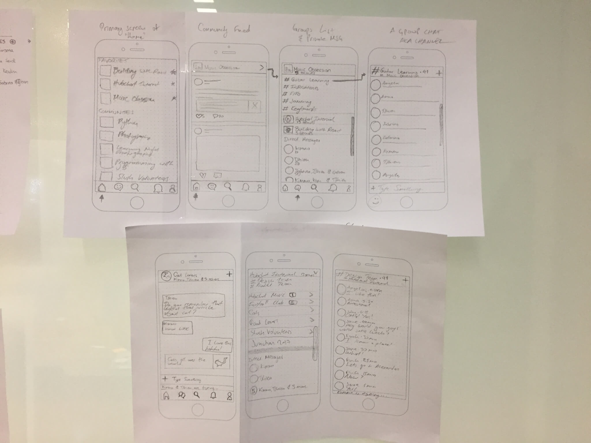
Once we discussed the concept with the design team and it was clear what kind of flows the users would have, we went into the mockup phase where we started designing in Sketch. This phase was done as a co-design session with all designers (product and service design). It was easy because the prototyping was done in a clear way and we had to convert certain designs we have implemented already while designing a few more.
We designed different states of the app flow, even empty states. The idea was that you would never be greeted with a page that you would not know what to do.
Mapping the Journey
We designed the whole journey of a new user entering Hubchat. The premise of the thesis was that someone gets an invite and goes through a small on-boarding and joining a community. There they would join automatically the public channels they are entitled to see, and the community feed. They would also be greeted by a bot in the private messaging, to give the idea of private messages as well.
The most important tasks for the user would interchange quite easily through the app. The community and the channel list will be always accessible while swiping right from anywhere in the app. The app would also have on the bottom navigation 5 elements for the users to navigate around:
- Community list - the list of communities and their channels (the user could be part of many communities at the same time, and all of them in one place)
- Private messages - Real-time one-to-one but also group user interaction
- Search and discovery - Find relevant communities and places to volunteer in, learn and get involved
- Notifications - check your mentions and important post notices from your communities
- User profile - your personal information and stats
Clickable Prototype
Once the whole user journey for this scenario was mapped and we had a clear understanding, it was time to stitch everything together in a clickable prototype. For this purpose we use Invision. Invision pairs extremely nicely with the Craft plugin for Sketch and Sketch itself.
In Invision we created the prototype in detail. We even had to create certain sequences of the app to imitate real time messages, notifications and different states of screens. We had to run some testing to make sure that all the screens were accounted for and that it made sense and when we were happy with the app (no dead ends etc) it was time to go meet our potential new users.
User Testing
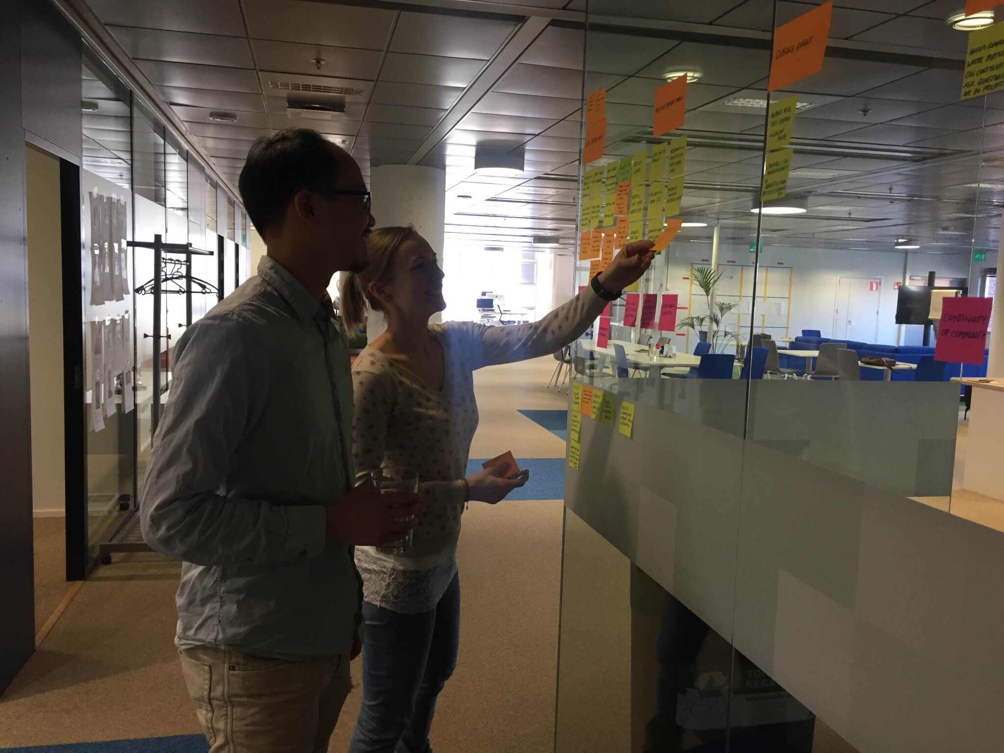
For user testing, and across the design sprint of the whole app concept we created this for Junction Hackathon. And we met the Junction organising team in order to test it with them. We sat with them and had an intro towards what they do. They explained to us their methods of communication, their processes and their pain points.
I happen to know many of them since I am also a member of Junction organisers but this was a typical procedure to start validating assumptions we created while designing the app concept.
The Junction team tested the app. We used Mr Tappy in order to record their actions, and the design team was asking questions and taking notes along the whole part of the meeting. We discussed on what makes sense, what was confusing and also what they would like to see different. Junction team were extremely valuable users. They gave us a lot of ideas about our app, validated many of our assumptions and gave us ideas for further design and development.
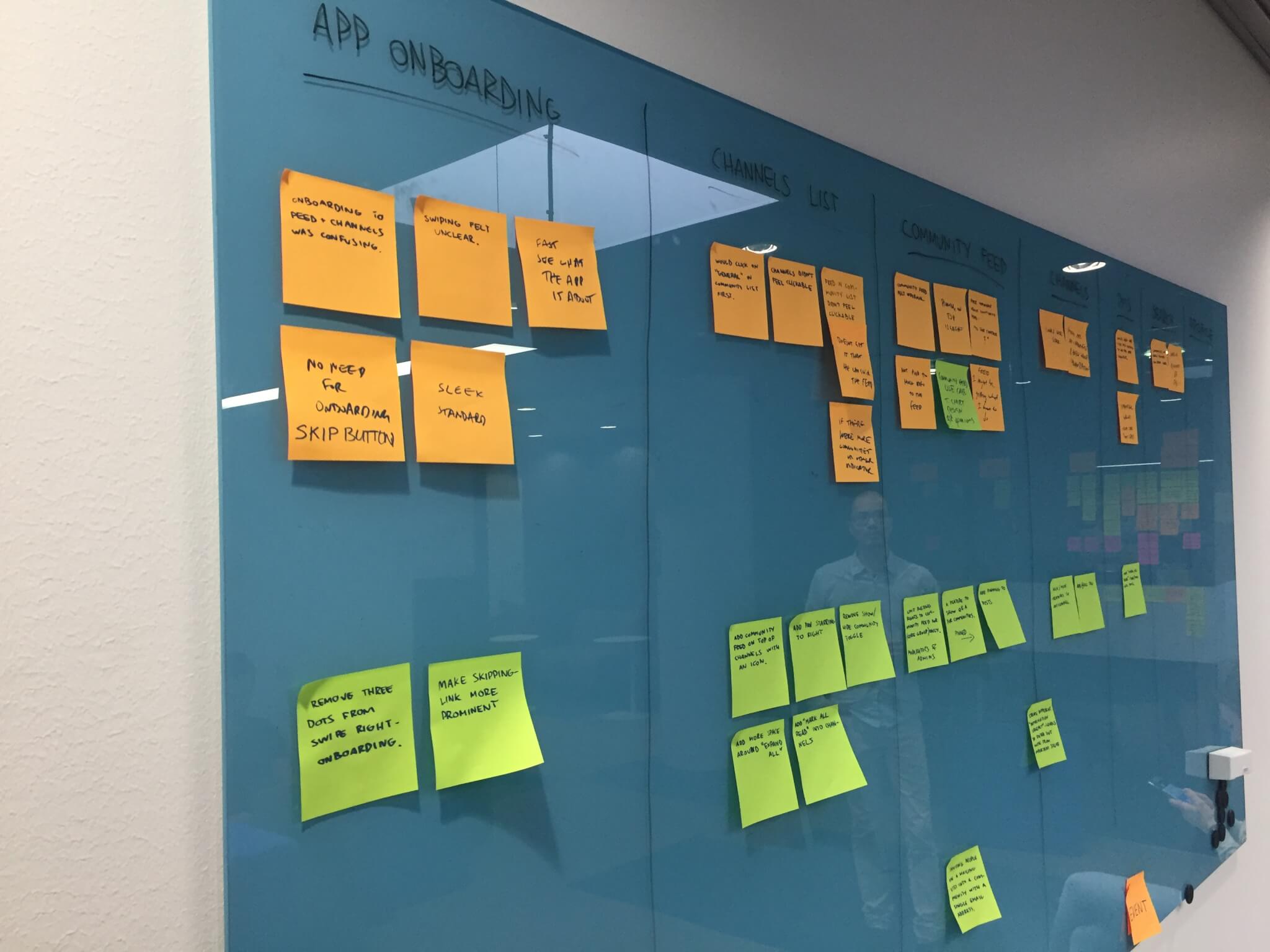
Next up to this process was to go back to the office and discuss and compare notes. We created a board that had phases of Junction as an event:
- Long before the event - How do they recruit new people and let everyone know the primary communication tools, and work etiquette of the whole team
- A few days before the event - How does the team make sure everyone knows what they do and their responsibilities
- During the event - Making sure that the event runs smoothly and everyone is accounted for
- After the event - Keeping in contact with the participants, helping them, and keeping an alumni-type of network
Iterations
During the discussions that took part after the event we made sure we wrote down whatever we discussed with the Junction team. We wanted to change certain things that they pointed out and we agreed that they made sense to make them more understandable and dead simple for the users to use.
Result
By the end of the cycle of designing this new concept and validating it we learned a lot. We designed a concept that would change our app to the core and it was extremely important to validate that this was the right course that it could take. We were already doing user testing with outside users for our features and concepts but those were usually more specific. However during this concept run, we had to design and test a whole app basically so finding the right people - a target audience, it was crucial and it seemed to pay out.
Key findings
- Starting to design a concept from scratch is always difficult and it can feel chaotic in the start.
- Redesigning an app and having to think outside the box leaving away your own bias for the app you spend months building can be a challenge on its own.
- Building fast on High fidelity mockups and making a working prototype with only image screens pays off because you use less resources (no development time spent on this).
- Bravely killing features that you previously done and are redundant now, is always a sane thing to do and sometimes feels therapeutic.
- Building in atomic design principles and using elements pays off in the end especially when you have to redesign parts of your app along with creating new concepts.